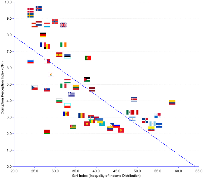

Corruption and inequality of income distribution are correlated (r = -0.71). The chart shows the scatter of 54 nations according to their individual Gini and Corruption Perception indexes in 2006. Corruption is measured by CPI (from 0.0 for highest, to 10.0 for lowest corruption), and inequality of income distribution by the Gini Index (from 0 for perfectly egalitarian, to 100 for totally inequalitarian). The light blue dotted line is the linear regression indicating the functional relationship between the two variables. It reveals the relationship between corruption (Y-axis) and income inequality (X-axis): an increase of income inequality is accompanied by the increase of corruption. The regression tells us that 50% (R² = 0.5) of the CPI variation is explained by the variation of the Gini index.