areppim: information, pure and simple
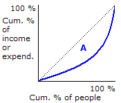
 The Gini coefficient, also known as Gini index or Gini ratio, measures the extent to which income or expenditure is shared among the members of a community. It can be illustrated by means of a Lorenz curve (the thick blue curve in the chart), a graphical device showing cumulative percentage relationships between two variables. The horizontal axis indicates the cumulative percentage of the population. The vertical axis indicates the cumulative percentage of income or expenditure associated with the population on the horizontal axis, starting with the poorest and ending with the richest.